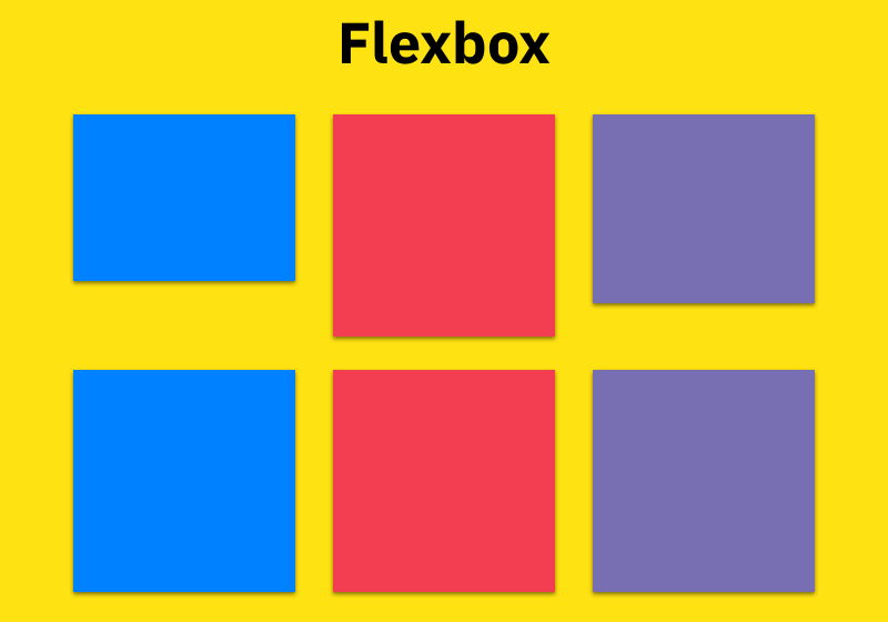
Chia sẻ Flexbox Boilerplate phiên bản Less
// --------------------------------------------------
// Flexbox LESS mixins
// The spec: http://www.w3.org/TR/css3-flexbox
// --------------------------------------------------

// Flexbox display
// flex or inline-flex
.flex-display(@display: flex) {
  display: ~"-webkit-@{display}";
  display: ~"-ms-@{display}box"; // IE10 uses -ms-flexbox
  display: ~"-ms-@{display}"; // IE11
  display: @display;
}

// The 'flex' shorthand
// - applies to: flex items
// <positive-number>, initial, auto, or none
.flex(@columns: initial) {
-webkit-flex: @columns;
-ms-flex: @columns;
flex: @columns;
}

// Flex Flow Direction
// - applies to: flex containers
// row | row-reverse | column | column-reverse
.flex-direction(@direction: row) {
-webkit-flex-direction: @direction;
-ms-flex-direction: @direction;
flex-direction: @direction;
}

// Flex Line Wrapping
// - applies to: flex containers
// nowrap | wrap | wrap-reverse
.flex-wrap(@wrap: nowrap) {
-webkit-flex-wrap: @wrap;
-ms-flex-wrap: @wrap;
flex-wrap: @wrap;
}

// Flex Direction and Wrap
// - applies to: flex containers
// <flex-direction> || <flex-wrap>
.flex-flow(@flow) {
-webkit-flex-flow: @flow;
-ms-flex-flow: @flow;
flex-flow: @flow;
}

// Display Order
// - applies to: flex items
// <integer>
.flex-order(@order: 0) {
-webkit-order: @order;
-ms-order: @order;
order: @order;
}

// Flex grow factor
// - applies to: flex items
// <number>
.flex-grow(@grow: 0) {
-webkit-flex-grow: @grow;
-ms-flex-grow: @grow;
flex-grow: @grow;
}

// Flex shrink
// - applies to: flex item shrink factor
// <number>
.flex-shrink(@shrink: 1) {
-webkit-flex-shrink: @shrink;
-ms-flex-shrink: @shrink;
flex-shrink: @shrink;
}

// Flex basis
// - the initial main size of the flex item
// - applies to: flex items
// <width>
.flex-basis(@width: auto) {
-webkit-flex-basis: @width;
-ms-flex-basis: @width;
flex-basis: @width;
}

// Axis Alignment
// - applies to: flex containers
// flex-start | flex-end | center | space-between | space-around
.justify-content(@justify: flex-start) {
-webkit-justify-content: @justify;
-ms-justify-content: @justify;
justify-content: @justify;
}

// Packing Flex Lines
// - applies to: multi-line flex containers
// flex-start | flex-end | center | space-between | space-around | stretch
.align-content(@align: stretch) {
-webkit-align-content: @align;
-ms-align-content: @align;
align-content: @align;
}

// Cross-axis Alignment
// - applies to: flex containers
// flex-start | flex-end | center | baseline | stretch
.align-items(@align: stretch) {
-webkit-align-items: @align;
-ms-align-items: @align;
align-items: @align;
}

// Cross-axis Alignment
// - applies to: flex items
// auto | flex-start | flex-end | center | baseline | stretch
.align-self(@align: auto) {
-webkit-align-self: @align;
-ms-align-self: @align;
align-self: @align;
}

